
For the first stage of colour experiments, thee were fairly successful. Although the red i mixed cam out as a fusia pink (it was meant to be red with a hint of strawberry) i thought they looked quite good.
The main aim was to see how each screen layered over the top, light colour on top or dark colours. how different colours reacted to different orders of printing.


This one had a cream layer over the very top. it was good to see how the print came out after printing the lightest layer last.

With a few of these examples i also experimented with printing a solid background colour first, so there would be no areas of white showing at all.


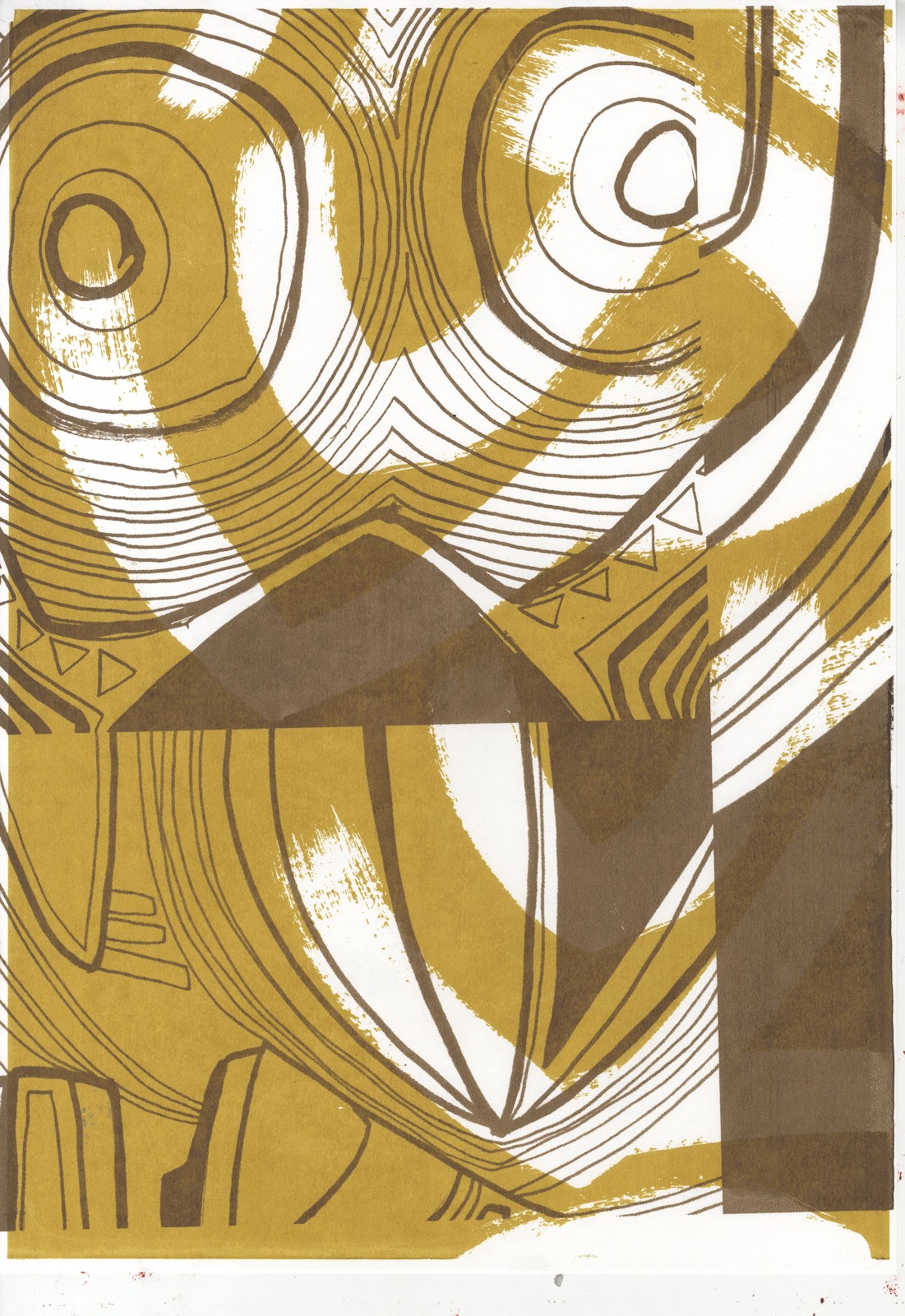
Most of the prints have only 3 layers but this one has 4 as i chose to add the brown detail over the top as an afterthought.


Absolutely stunning Ruth, extraordinary range of mark marking possibilities.The images explode in all directions! Keep up the excellent work, we can't wait to see more. Lydia from www.fawnartconsultancy.co.uk
ReplyDeleteThankyou for the positive feedback Lydia. they're test samples for a wallpaper collection but I'm thinking about producing some stand alone prints from this idea as well.
ReplyDelete